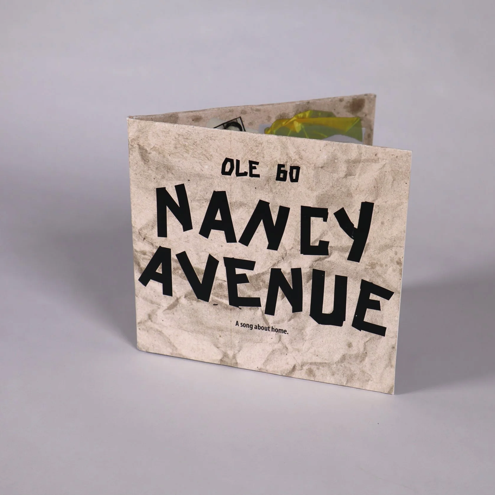
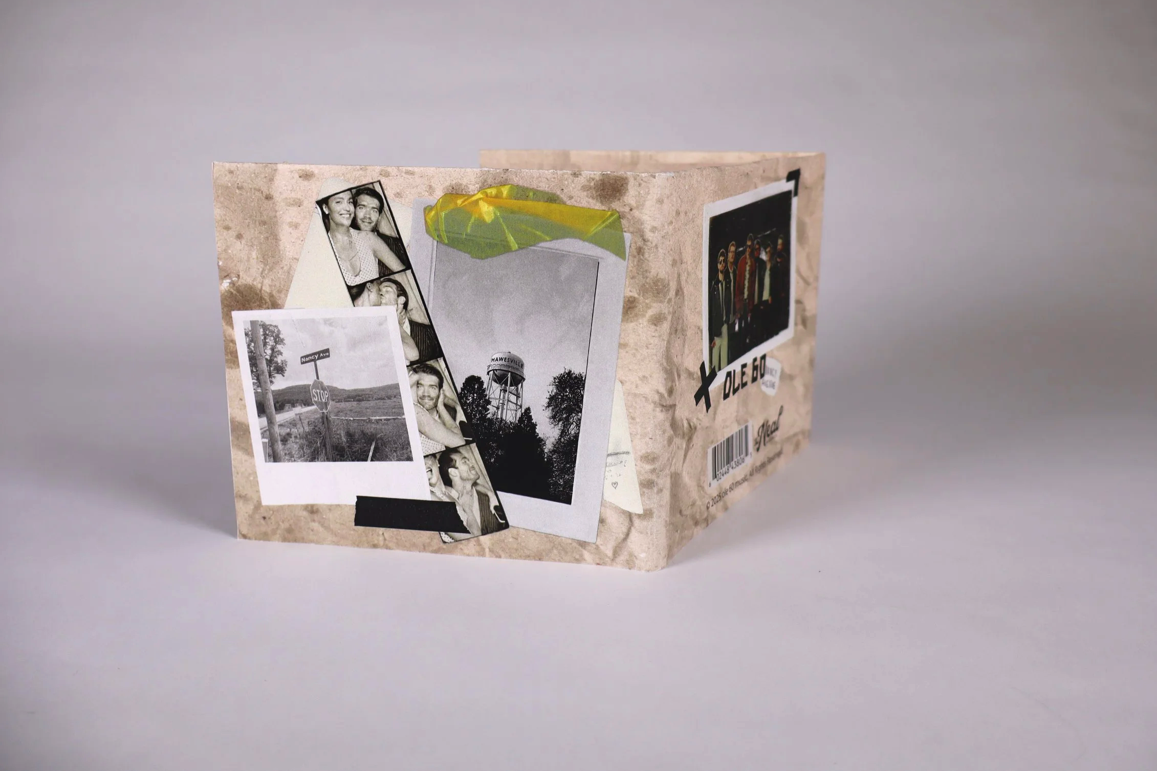
This project focused on designing physical CD packaging for a song of our choice. We could pick any song, a single or not, but we were design the packaging as if it our chosen song was a single. I chose the song Nancy Ave by Ole 60 because of the imagery and nostalgic feeling the song has. The goal was to design and produce by hand a tactile, print-driven package that reflects the band’s sound and identity while functioning as a cohesive, folded format.
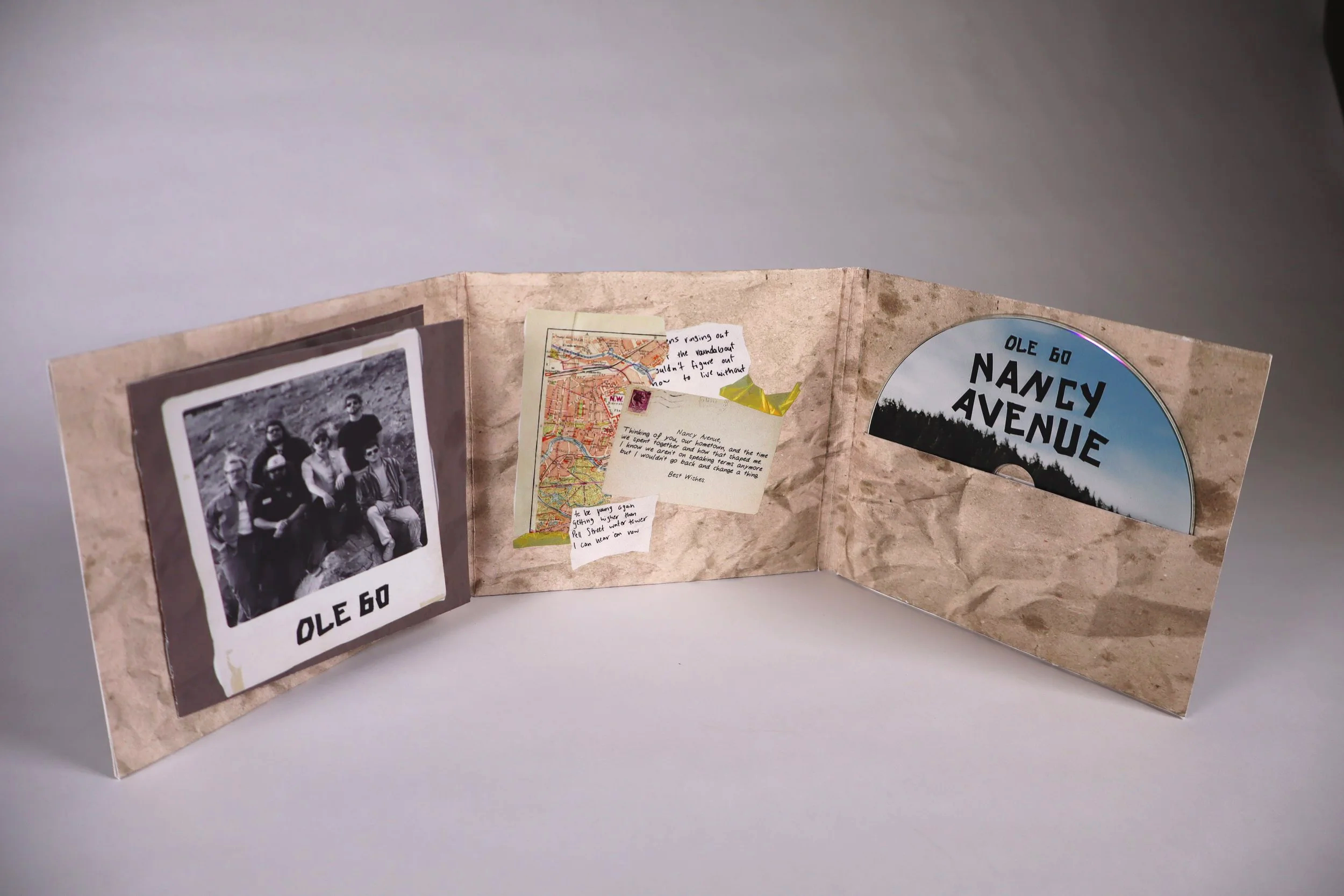
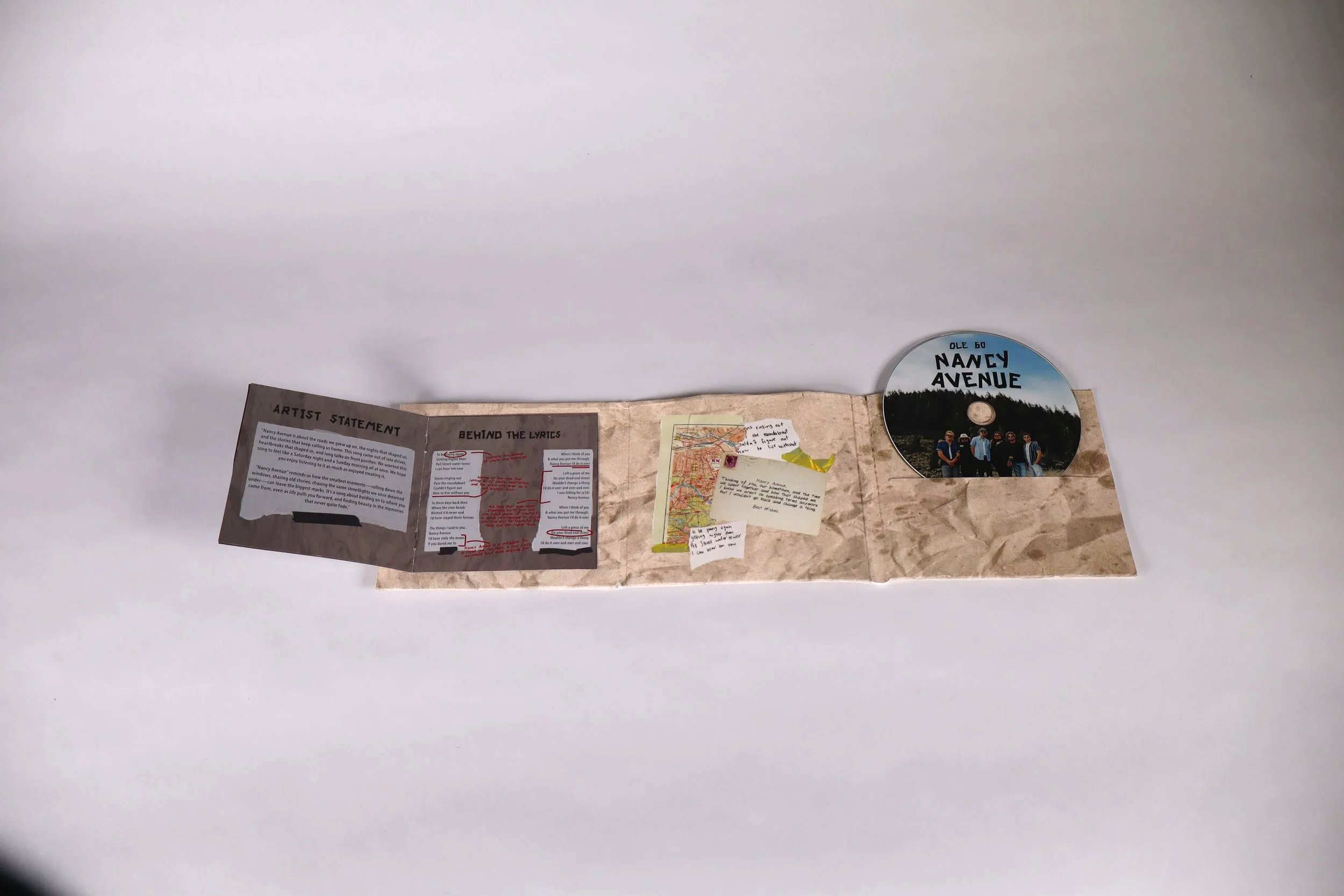
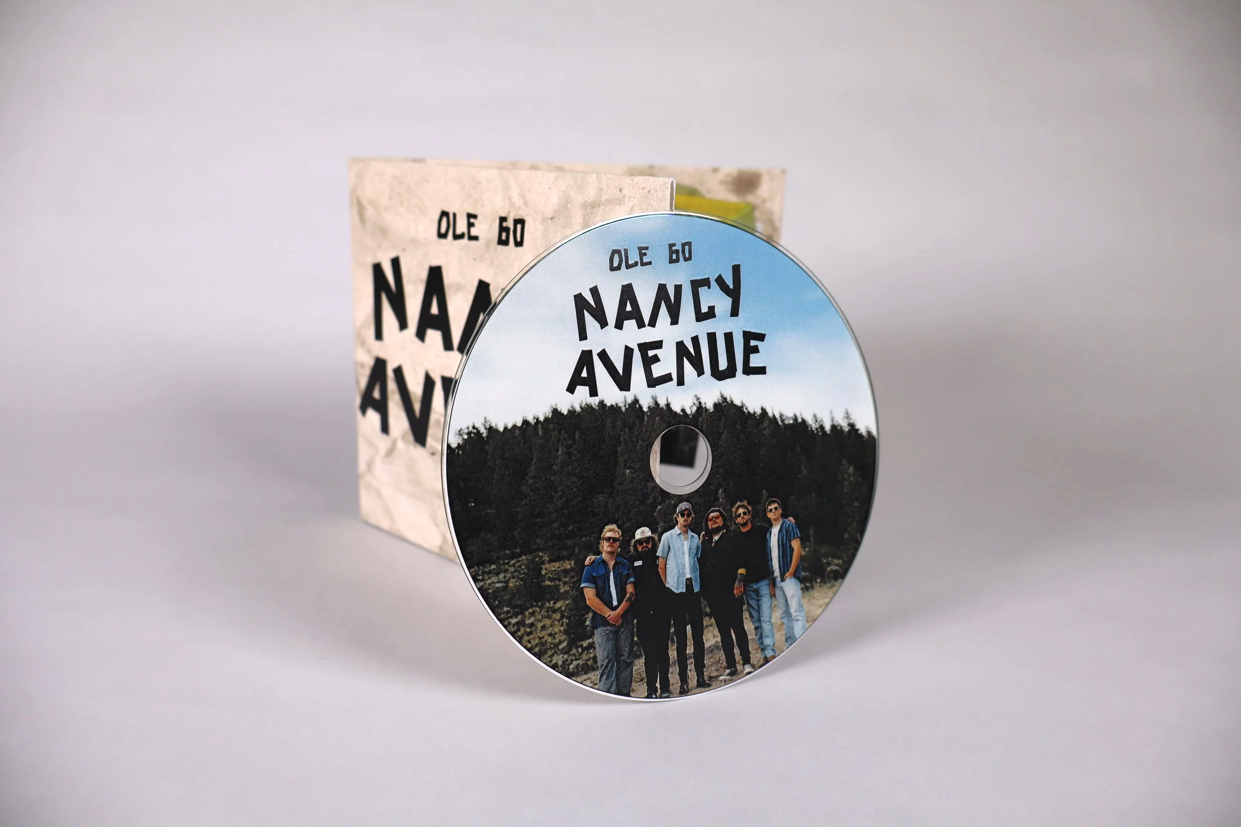
I approached the design with an emphasis on texture, typography, and authenticity aiming to capture the sense of nostalgia that Ole 60 writes about.. The distressed paper background and muted color palette were chosen to give the packaging a worn, lived-in feel that aligns with the band’s gritty, roots-driven aesthetic. Bold, condensed typography anchors the front cover, while supporting elements such as imagery, icons, and labeling to add visual interest without overwhelming the composition.
The layout was carefully considered to work across multiple panels, ensuring clarity and consistency when the package is fully opened or folded. This project strengthened my understanding of packaging structure, print layout, and how design choices translate from screen to physical form.
CD Packaging- Nancy Ave by Ole 60